
A Land of Tibet
*
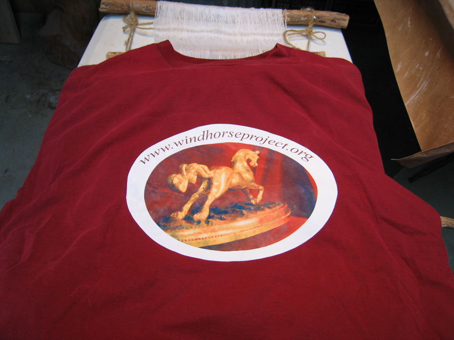
With the work getting the studio prepared for winter I haven't been able to work on the sculpture. In the meanwhile though, here's a shirt design to promote a Windhorse Project. It looks fantastic I think! You can see what I mean about the importance of creating an address that is a bit shorter and easier to remember. It's also easier to fit the name into graphics.
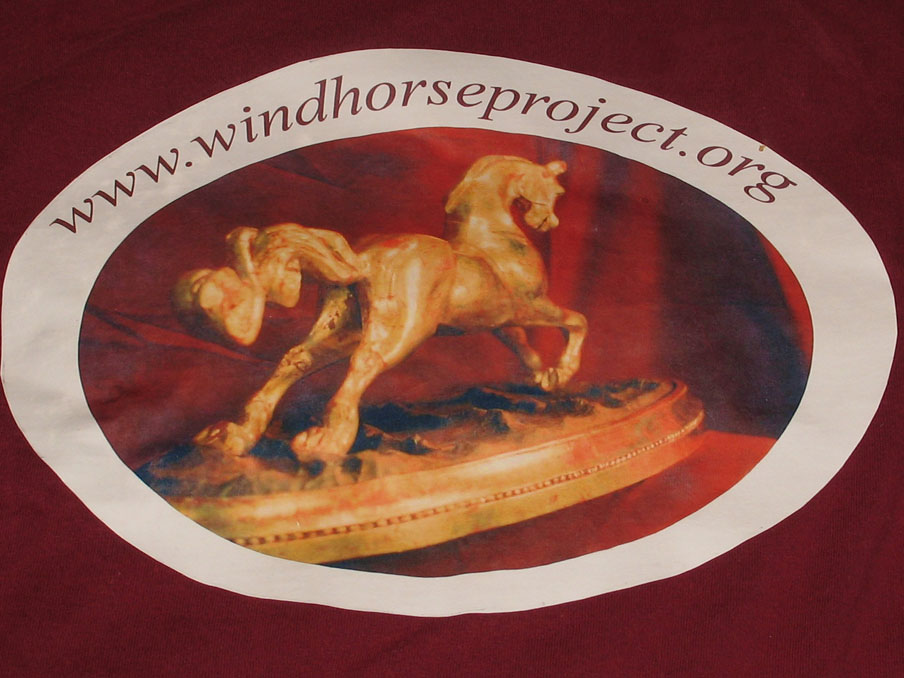
Here's a closeup. That blurring only shows up under intense overhead light ; it's just a sheen created from the iron. There's some experimenting to be done with iron temperatures and the length of ironing time. I increased the color saturation of the picture before creating the iron-on so the colors would show up better.
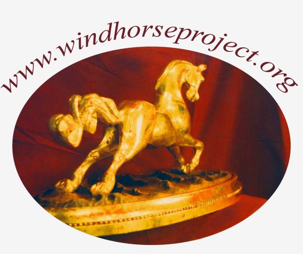
The colors look very intense on the screen!
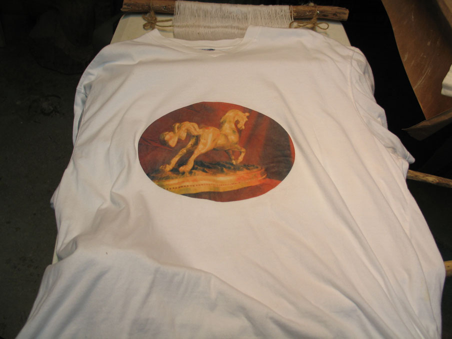
This the shirt design I created first. It's a slightly different type of iron on. You have to flip the image before you print it because it's put on the fabric face down just as with the printing block. I usually forget this if I haven't tried it in awhile. The colors are somewhat less intense but they look just fine!
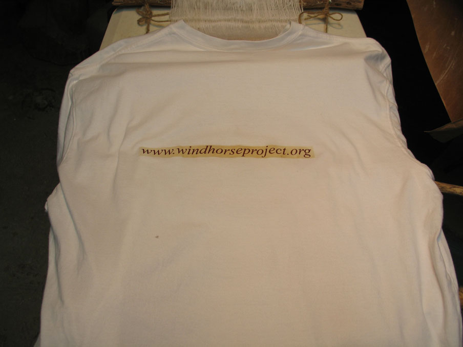
Here's the lettering on the back. It was actually going to be lighter but the iron was very hot and changed the color! It's fine although it does look like a peice of masking tape. The most important thing though is that it's easy to read! I'll try the design with the lettering near the picture next. I have to figure out how to create a line around the whole thing in the photo editing software to to act as a cutting guide though. It's rather tough cutting out the picture in that shape! Here are some more possible designs...
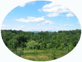
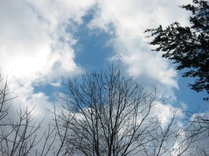
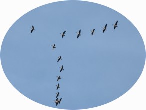
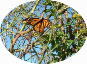
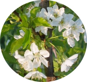
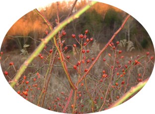
Since Tibetans have a reverence for all living beings any of these would be just fine I think!
please click here to continue...

* courtesy of A Luminous Diamond (Bright) Crystal Show productions. The information for
the sketches is courtesy of the Footprint Tibet handbook by Gyurme Dorje.